Ah, I said I was going to try to post more . . . and months have past since I’ve done so.
It’s not that I don’t have things to say, but that I am out of the habit of saying.
So I’ll show, instead. My photography skills are still rudimentary and while I have opened GIMP I haven’t actually done anything with it, so all of the photos, below, are as I took them.
A college friend was in town recently and we walked all over lower Manhattan, the LES and the East Village. I thought I had covered that area pretty well on previous walks, but then we came upon this skater park, tucked under the Manhattan Bridge.

This was the first thing I saw, and I knew I had to go back and shoot it and the rest of the park. And so I did.
Neither this nor what follows are very good—not only am I working on my “eye”, I’m still getting used to everything the camera can do—but this was such a great place to train myself, and hey, gotta start somewhere.


I like black and white, but the color is so much a part of the graffiti that I think it works better; that said, I think once I get better I’ll figure out how to make this work in B&W.
Similarly:
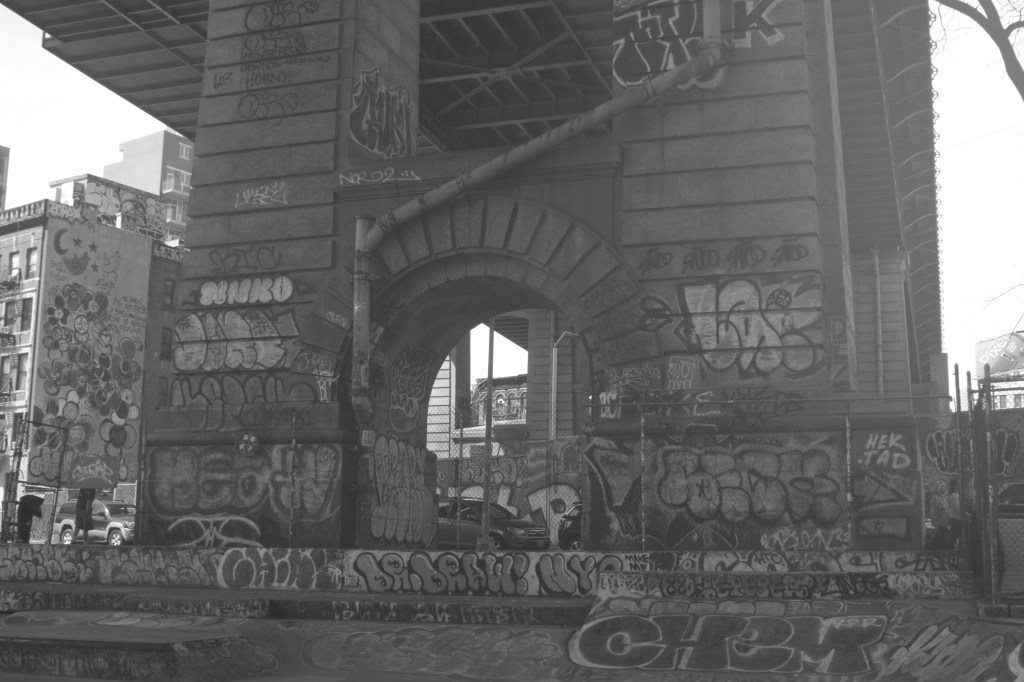

I think I know what I did wrong with the B&W, but, like I said, at this point I’m treating this all as practice.
And what a place to practice. Honestly, I find this one of the most beautiful places I’ve come across in New York City. I can’t wait to come back when the light is slanting through and there are more skaters; I can’t wait until I’m confident enough to shoot the skaters.
Okay, a few more, this time toggling back and forth between B&W and sepia. When I first got my camera and saw that sepia was an option I thought Bah! and dismissed it as fake-old, a simulacra. But then I thought, What the hell, let’s see what it does.

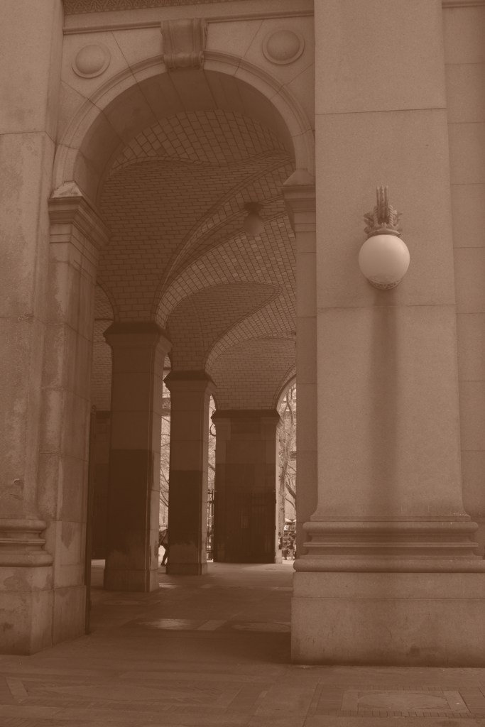
No clear winner, here; I’m not crazy about the exposure for either pic.

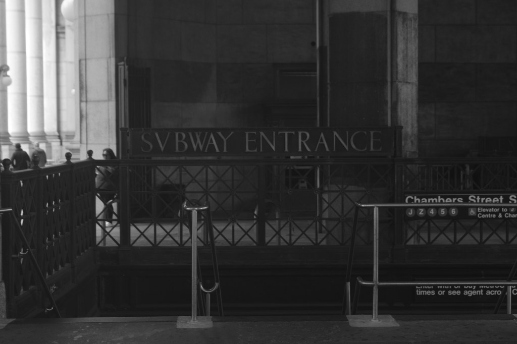
The first is too light; the second, too dark.

Not sure the sepia adds anything here, either.
But it does work for this:
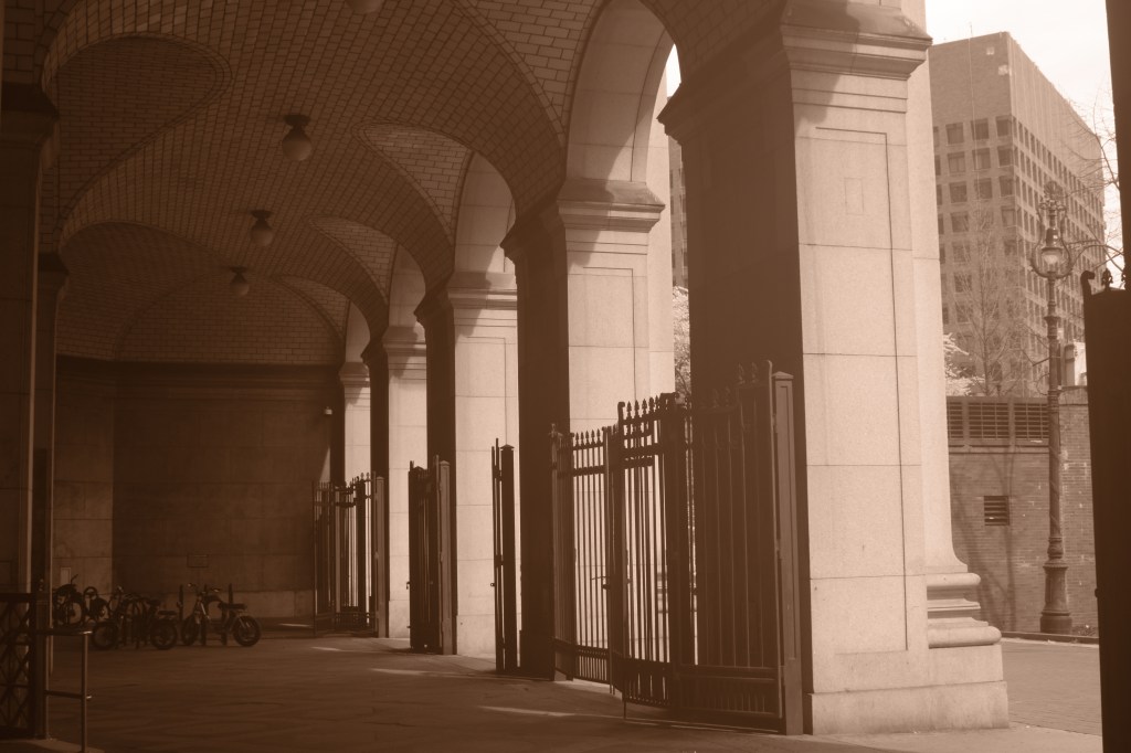
And for this one:
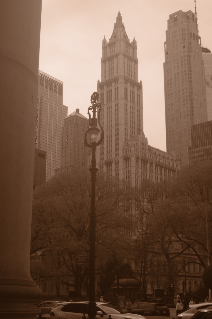
Although, again, the exposure is off, as the top is too light and the bottom perhaps a smidge too dark.
I do prefer higher contrast, which tends to be more apparent in darker photos, and sharper to softer images. Again, with practice both my eye and my camera skills should improve.
And what a gift that I live in this city: I can shoot and fail and know, following Beckett, that I can go back and shoot again, fail again, fail better.

Do not ema
the black and white of the columns and the sepia of the lampost have a nice mix of object(s) and background, scale is tricky with architecture pics. when i took a class in the wayback days of chemical developing they had us start with black and white closeups of patterns and contrasts and then build up (and out) from there which i found helpful.
the skaters will be flattered by the attention
Austerity For Austerity’s Sake In The UW System
https://www.wortfm.org/apa-12-04-23/